And that’s when I know/she’s gonna be pissed when she wakes up/from terrible things I did to her/in her dreams…
-Ben Folds
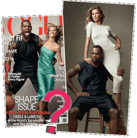
Okay, before I say much, here’s an image, linked from http://concreteloop.com/2008/03/comment-spotlight-lebron-the-vogue-cover (interesting mix of comments there, btw… well worth your time to read).
![]()
![]()
I’m a fan of LeBron James, though he’s not one of my once beloved Pacers. I’m not so much a fan of Gisele, as she dates that Brady fellow, but I’d like to think LeBron didn’t mean to be presented the way Vogue presented him on their current cover, and I’m not entirely sure Gisele should be comfortable with it, either.
I’ve read many comments around the net, so I won’t claim I have some brilliant observation, but my first thought was “oh, great, LeBron is King Kong stealing Tom Brady’s girlfriend.”
But let’s take a look at this cover, visually. The “real” cover, obviously, is the image to the left, while the alternate cover image uncovered by ConcreteLoop.com is the tasteful photo on the right. On the actual cover, there’s brighter lighting (which brings the skin tone differences into starker contrast), and there are wildly conflicting facial expressions. LeBron looks angry, or beastly, while Gisele looks like she might well have been caught laughing at how ridiculous the image is. LeBron is hunched over, simian (also like one might drive with a basketball, to be fair), and he’s handling a ball. It’s a confusing composition, as I suppose we’re supposed to think we see the “essence” of the two (the intense athlete and the smiling model?) or perhaps that LeBron Kong has taken a woman as he streaks down the court. It’s also interesting that Gisele is wearing a dress that is roughly the same shade as the Statue of Liberty, not that anyone would be playing up the King Kong thing.
Contrast that to the other image, which looks like an actual fashion shoot. The colors are muted, the poses are relaxed and seem human. LeBron’s muscles are highlighted, as is his face (which doesn’t look animalistic in this shot) and Gisele’s figure is showcased without her being presented as if she is being seized and controlled (as a male, I have to say I think she looks better in the white dress, too). The composition has good lines, and other than the awkwardness of placing Vogue’s header on the page, the spaces for the other cover text are all natural. If the image were cropped right at LeBron’s knees and some extra space were airbrushed in at the top, it’d be a perfect cover.
It looks like Vogue dropped the ball. So to speak.
